Colour is more than just a visual element—it’s a powerful psychological tool that shapes how consumers perceive and interact with brands. From evoking emotions to influencing purchasing decisions, colour choices can make or break a brand’s identity. Understanding the psychology behind colour can help businesses create stronger connections with their audience and reinforce their brand message.
So, how do different colours impact perception, and how can brands harness colour psychology effectively?
The Science Behind Colour Psychology
Colours trigger subconscious associations and emotions, often influencing behaviour before we’re even aware of it. Studies in colour psychology suggest that people form an opinion about a product or brand within 90 seconds, and up to 90% of that assessment is based on colour alone.
Different colours carry unique connotations, shaped by culture, context, and personal experience. Here’s a closer look at the emotional and psychological effects of common brand colours.
What Different Colours Communicate in Branding
Red: Energy, Passion & Urgency
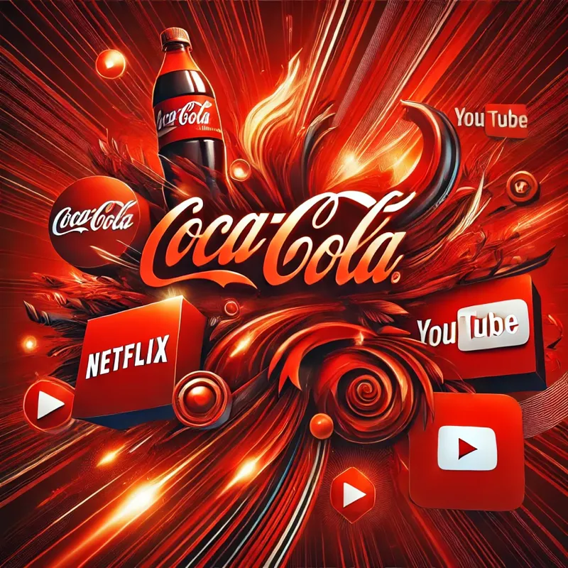
Red is a high-arousal colour that grabs attention, stimulates appetite, and conveys excitement.
✅ Used by: Coca-Cola, Netflix, YouTube, Lego
✅ Best for: Food brands, entertainment, sales promotions, call-to-action buttons
Caution: Overuse can feel aggressive or overwhelming.
Blue: Trust, Stability & Professionalism

Blue conveys calmness, reliability, and intelligence, making it a favourite among tech and financial brands.
✅ Used by: Facebook, LinkedIn, PayPal, IBM
✅ Best for: Finance, healthcare, tech, corporate brands
Caution: Can feel cold or unapproachable if not balanced with warmth.
Yellow: Optimism, Happiness & Creativity
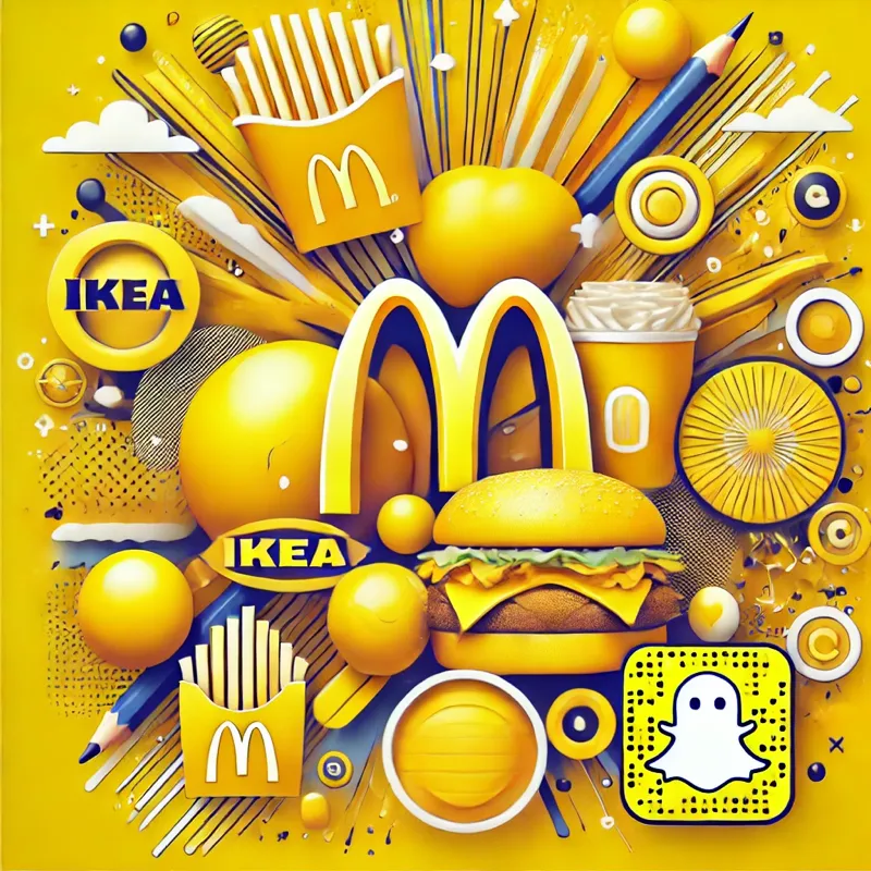
Yellow sparks positivity and is often associated with warmth and friendliness.
✅ Used by: McDonald’s, IKEA, Snapchat
✅ Best for: Retail, hospitality, creative brands
Caution: Overuse can lead to visual fatigue or feelings of anxiety.
Green: Growth, Health & Sustainability
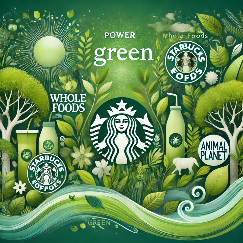
Green represents nature, balance, and prosperity, making it ideal for eco-friendly and wellness brands.
✅ Used by:Starbucks, Whole Foods, Animal Planet
✅ Best for: Organic products, finance, wellness industries
Caution: Can feel overly corporate if not balanced with warmth.
Purple: Luxury, Creativity & Spirituality
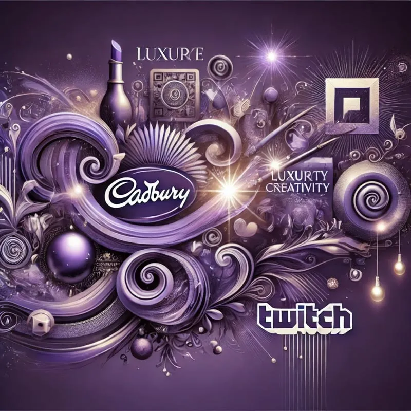
Purple is often linked to royalty, imagination, and sophistication.
✅ Used by: Cadbury, Hallmark, Twitch
✅ Best for: Beauty, luxury goods, creative brands
Caution: Can feel too niche or high-end for mass appeal.
Black & White: Minimalism, Power & Timelessness
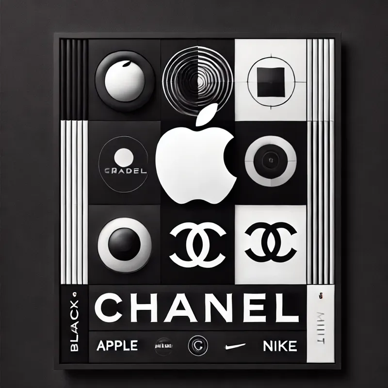
Black signifies elegance and exclusivity, while white suggests purity and simplicity.
✅ Used by: Apple, Chanel, Nike
✅ Best for: Luxury brands, fashion, high-tech industries
Caution: Overuse of black can feel intimidating; too much white can appear bland.
How to Choose the Right Colours for Your Brand
Picking the right colours isn’t just about aesthetics—it’s about aligning with your brand’s personality and audience expectations.
✅ Know Your Target Audience – Different demographics respond to colours in unique ways. Consider age, gender, culture, and industry norms.
✅ Stay Consistent – A well-defined colour palette ensures brand recognition. Think about McDonald’s yellow or Tiffany’s iconic blue.
✅ Consider Colour Combinations – Pairing colours strategically can enhance contrast and readability. Complementary colours (opposites on the colour wheel) create bold contrasts, while analogous colours (next to each other) create harmony.
✅ Test & Adapt – Use A/B testing in marketing materials to measure how different colours impact engagement and conversion rates.
Final Thoughts: The Power of Colour in Branding
Whether you’re designing a logo, website, or packaging, your brand’s colour choices will shape customer perceptionsand influence their decision-making. By understanding the psychology behind colour, businesses can create more impactful branding that resonates with their audience.
What colour best represents your brand?
If you have found this useful, listen to our follow up Podcast on this subject.