Typography is more than just the choice of fonts—it shapes a brand’s identity, influences user experience, and impacts readability. As we move into 2025, design trends are shifting, with some styles dominating while others feel tired and overused. Whether you’re a designer, marketer, or brand strategist, keeping up with typography trends ensures your visuals remain fresh, engaging, and effective.
Here’s a look at the top typography trends in 2025—what’s working, what’s fading, and how to apply these trends to your projects.
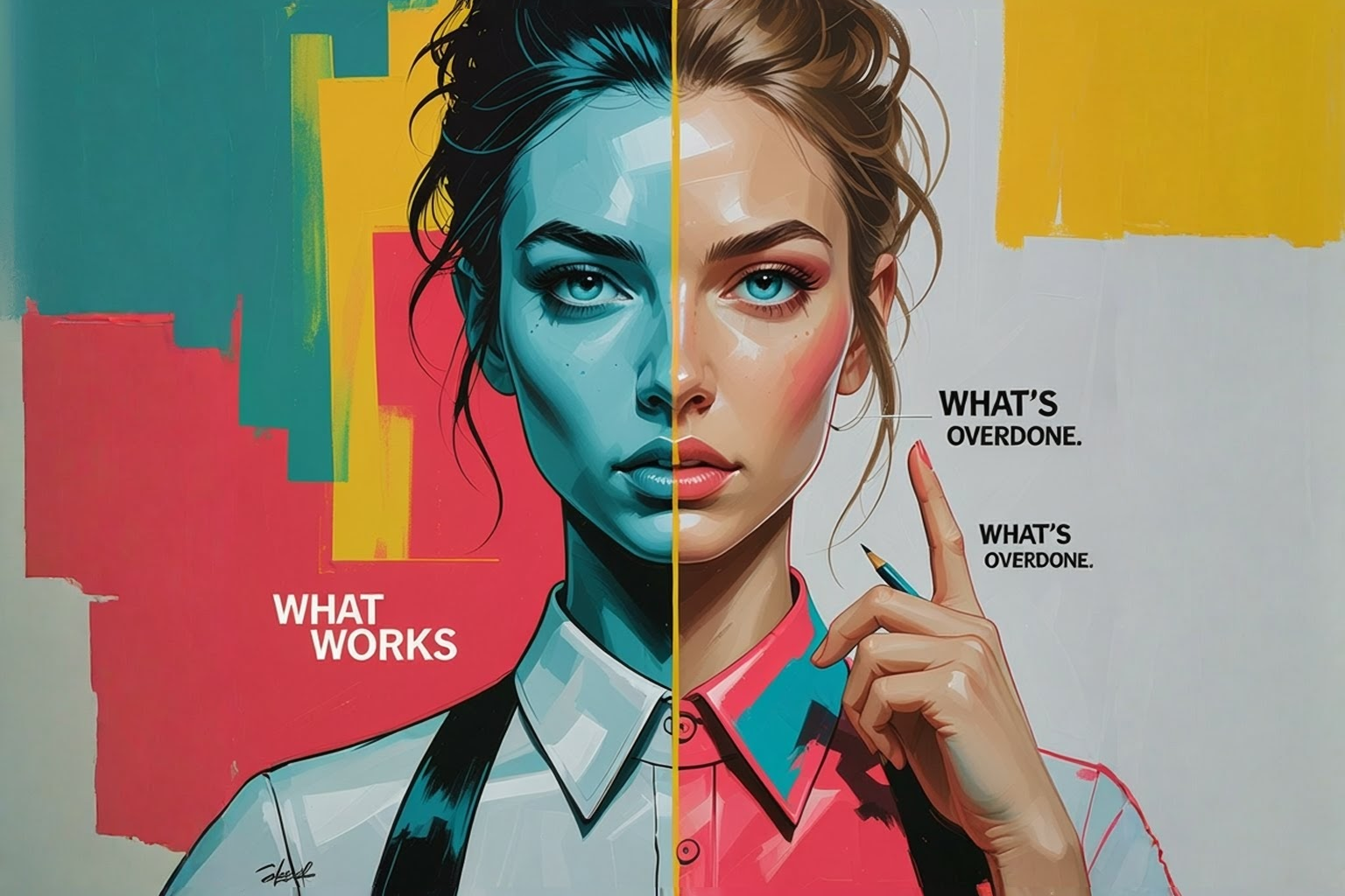
What’s Working: Typography Trends That Elevate Design
1. Variable Fonts for Dynamic, Responsive Design
Gone are the days of static fonts. Variable fonts allow for custom weight, width, and slant variations within a single file, reducing load times and enhancing flexibility across different screen sizes.
How to use it: Implement variable fonts in website and app design to improve legibility across devices while keeping performance optimised.
2. Big, Bold, and Expressive Typography
In 2025, brands are using large-scale, attention-grabbing fonts to create impact. Oversized typography helps with brand recognition and creates a powerful first impression.
How to use it: Pair bold typography with minimalist design elements for maximum readability and impact.
3. High-Contrast Serif Fonts Make a Comeback
Serifs, especially high-contrast ones, are regaining popularity in digital spaces. They bring a sense of elegance, heritage, and sophistication while still feeling modern.
How to use it: Use high-contrast serifs in luxury branding, editorial design, and premium product websites.
4. Kinetic Typography for Motion and Engagement
With the rise of digital storytelling, kinetic typography—where text moves, animates, or changes dynamically—adds a layer of engagement to brand content.
How to use it: Use animated type in social media ads, video content, and interactive website elements.
5. Nostalgic & Retro-Inspired Fonts (With a Modern Twist)
Vintage-inspired typography continues to trend, blending nostalgic elements from the 70s, 80s, and 90s with contemporary design aesthetics.
How to use it: Combine retro fonts with clean layouts and modern colours to balance nostalgia with contemporary appeal.
What’s Overdone: Typography Trends to Use Sparingly
1. Overly Decorative, Hard-to-Read Fonts
Highly stylised display fonts may look unique but often sacrifice readability, making them impractical for web and UI design.
Avoid: Excessively swirly script fonts or ultra-condensed letterforms in body text.
2. Brutalist Typography Without a Purpose
The raw, unpolished look of brutalist typography had its moment, but when overused, it can feel harsh and difficult to digest.
Avoid: Brutalist typefaces that prioritise aesthetics over usability, especially in text-heavy applications.
3. Default Sans-Serif Fonts Lacking Personality
While clean sans-serifs remain a staple, relying too heavily on default system fonts (like Arial, Helvetica, or Roboto) can make designs feel uninspired.
Avoid: Using default sans-serifs without any typographic hierarchy or customisation.
4. All-Caps Typography for Every Headline
While uppercase text can be impactful, overusing it can reduce readability and come across as too aggressive.
Avoid: Using all-caps for long sentences or body text—stick to short headlines or emphasis points.
5. Too Many Fonts in One Design
Mixing multiple typefaces can create contrast, but excessive variation distracts from readability and weakens the overall design coherence.
Avoid: Using more than two or three typefaces in a single design.
Final Thoughts: Typography Trends That Last
The best typography choices blend creativity with functionality. In 2025, expect to see bold expressions, increased motion, and a return to refined serif styles—all balanced with a strong emphasis on readability and brand consistency.
Typography should enhance, not overshadow your message. By staying ahead of the trends while avoiding the overdone, you can ensure your designs remain both stylish and timeless.